


Baskerville : Book Design
Historical figures in typography are often introduced through dense academic texts that can feel inaccessible to contemporary audiences. As a result, the craftsmanship, innovation, and cultural impact of early typographers such as John Baskerville are frequently overlooked or underappreciated by design students and general readers alike.
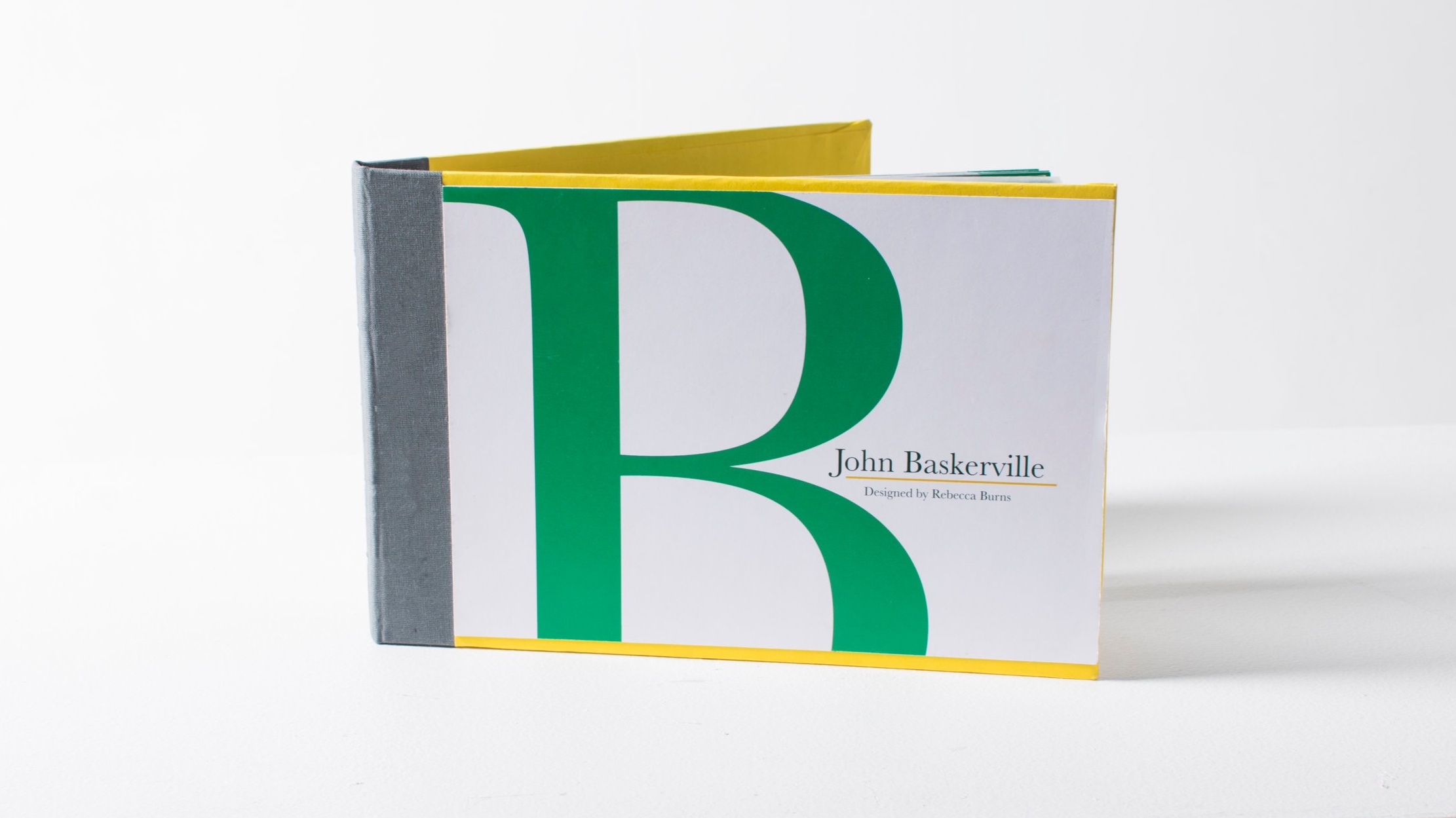
I wanted to create a publication that presents typographic history in a way that is visually engaging, tactile, and educational. John Baskerville’s contributions to printing and type design—particularly his refinement of letterforms and his association with vellum paper—made him an ideal subject for a format that could merge content with material exploration. My goal was to design a book that honors his legacy while demonstrating how physical structure and typography can enhance storytelling.
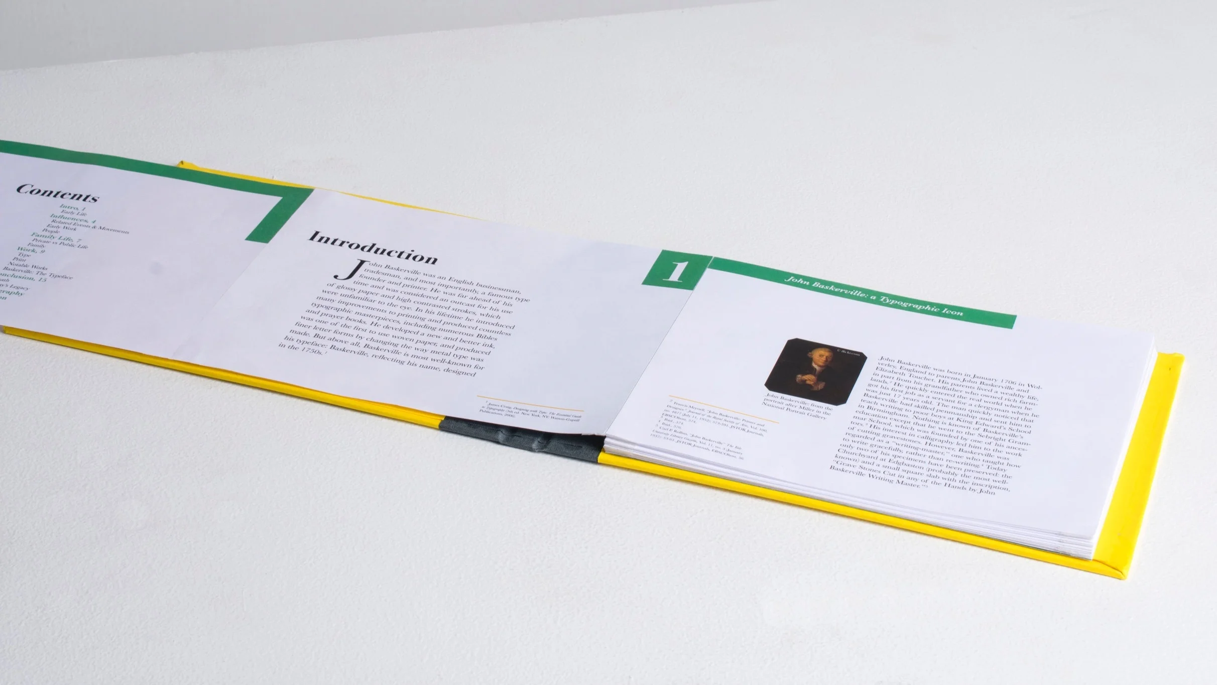
I designed a twenty-page book dedicated to the life and work of John Baskerville, structured around a cohesive typographic system and an accordion-fold binding to encourage continuous, exploratory reading. The layout balances historical text with strong visual hierarchy, allowing readers to move seamlessly between narrative content and visual analysis. To reflect Baskerville’s innovations, I incorporated sheets of vellum paper throughout the book, referencing his role in popularizing the material within fine printing. Large-scale reproductions of key letterforms from the Baskerville typeface are featured prominently, enabling readers to study the elegance, contrast, and precision of his design up close. The page composition, grid system, and material choices were all intentionally aligned to echo the refinement and clarity associated with his typographic style.
The final outcome is a tactile, visually cohesive publication that functions as both a historical study and a design artifact. The book presents Baskerville’s story in a format that is accessible, immersive, and educational, demonstrating how editorial design and physical structure can deepen engagement with typographic history.
This project strengthened my skills in editorial layout, typographic hierarchy, and book construction while deepening my understanding of historical research as a foundation for design decisions. It reinforced the idea that form and content should work together to communicate meaning. This publication demonstrates my ability to translate complex historical information into a thoughtfully crafted, visually compelling book design.